After decorating weddings for years, I can confidently say this: beautiful decor does not automatically mean beautiful photos. I’ve walked into stunningly styled venues that looked impressive in person, only to see the final gallery and realize the decor quietly worked against the camera. Couples are often surprised when this happens, especially after investing so much time and money into their wedding setup.
Wedding photography captures moments, emotions, and details from angles guests never notice. The camera is unforgiving. It records clutter, harsh lighting, awkward spacing, and reflective surfaces without mercy. What feels magical in real life can look chaotic, flat, or distracting in photos if decor choices aren’t made with photography in mind.
This is exactly why understanding wedding decor mistakes that ruin photos is so important. The goal isn’t perfection or over-styling. The goal is intentional design that supports your photographer, frames the couple beautifully, and keeps the focus where it belongs. When decor and photography work together, the result is timeless imagery you’ll love decades from now.
In this guide, I’m sharing the most common decor mistakes I’ve seen repeatedly over the years and how they impact wedding photos in ways couples rarely expect.
Why Wedding Photos Are So Sensitive to Decor Choices
Wedding photos rely heavily on balance. Light, color, spacing, and texture all play a role in how an image feels. Even small decor decisions can throw off that balance and change the entire mood of a photo. This is why photographers often comment on decor long before guests notice anything is wrong.
Lighting is one of the biggest factors. The camera reacts differently to light than the human eye. Dim corners, mixed lighting temperatures, or overly bright decorative lights can create shadows, discoloration, or glare that permanently affect the image. Once that moment is captured, it cannot be fixed completely in editing.
Another issue is visual noise. When too many elements compete for attention, the couple becomes just another part of the frame instead of the focal point. Chairs, florals, signage, draping, and installations must complement each other, not fight for dominance. The camera sees everything, even the things you hoped would fade into the background.
From a decorator’s perspective, every decor choice should answer one question: does this enhance the couple’s presence in the photo, or distract from it? When decor is chosen without that mindset, mistakes happen—often without anyone realizing it until after the wedding day.
Poor Lighting Choices That Flatten or Distort Photos
Lighting mistakes are, without question, one of the most damaging decor errors when it comes to wedding photography. I’ve seen breathtaking venues lose all their charm simply because the lighting was poorly planned or added as an afterthought.
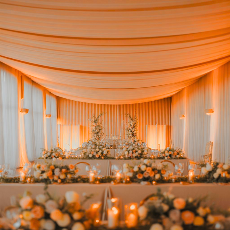
One common problem is relying too heavily on colored lighting. While colored uplighting may feel dramatic in person, it often casts unnatural tones on skin in photos. Faces can appear washed out, overly red, green, or blue, and correcting this later is difficult. The couple may look tired or discolored even when they felt radiant on the day.
Another issue is uneven lighting across the space. Bright dance floors paired with dark tables, or spotlight-heavy stages surrounded by shadows, confuse the camera’s exposure. This leads to blown-out highlights in some photos and muddy darkness in others. Consistency matters more than intensity.
I also see decorative lighting placed without considering angles. Exposed bulbs, mirrored surfaces, and glossy decor can reflect light directly into the camera lens, causing glare and lens flares that distract from the moment. Thoughtful lighting should illuminate, not dominate.
To avoid this mistake, I always recommend:
-
Prioritizing warm, neutral lighting tones
-
Testing lighting levels at the same time of day as the event
-
Coordinating decor lighting with the photographer and planner
Good lighting doesn’t call attention to itself. It quietly makes every photo look better.
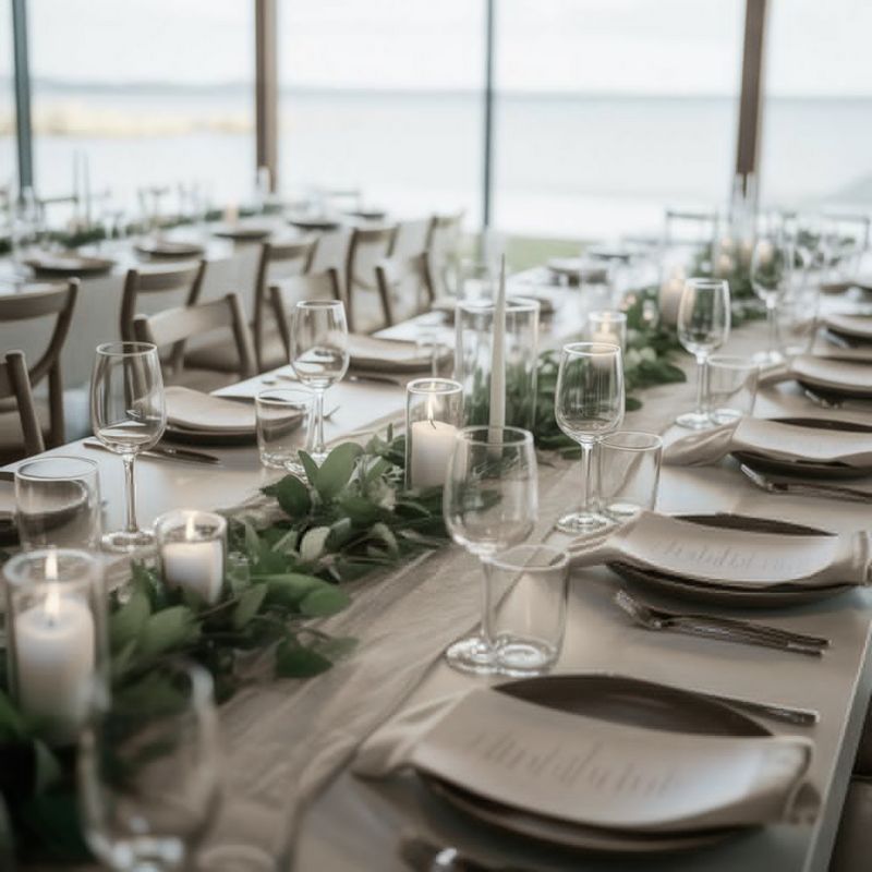
Overcrowded Decor That Creates Visual Chaos in Pictures
More decor does not equal better photos. In fact, overcrowding is one of the fastest ways to ruin otherwise beautiful wedding images. This mistake often comes from excitement—wanting to include every idea, trend, and inspiration in one space.
When tables are overloaded with centerpieces, candles, signage, and multiple textures, the camera struggles to find a resting point. The result is a busy image where nothing stands out. The couple’s details, expressions, and interactions get lost among competing elements.
Large installations placed too close together can also create problems. Backdrops, arches, floral walls, and draping should have breathing room. When everything is packed tightly, photos feel cramped and overwhelming, even in large venues.
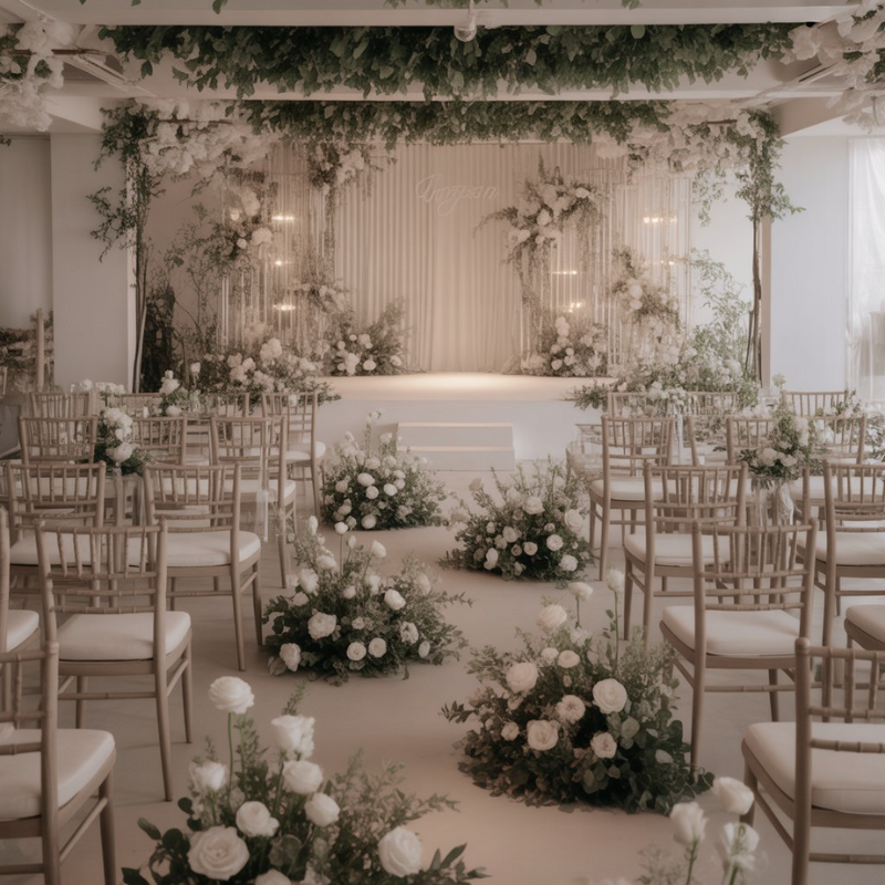
I often remind couples that negative space is not empty space—it’s intentional design. Allowing room around key decor elements helps the photographer frame clean, elegant shots. Simplicity, when done thoughtfully, always photographs better than excess.
A balanced approach works best:
-
Choose one or two statement pieces per area
-
Keep tablescapes cohesive, not crowded
-
Let the couple remain the visual focus in every setup
When decor supports the scene instead of overpowering it, photos instantly feel more refined.
Ignoring Color Harmony and Creating Visual Distraction
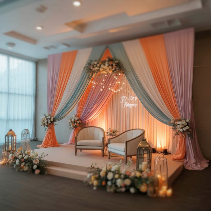
Color is emotional, but it’s also technical. One of the most overlooked wedding decor mistakes that ruin photos is ignoring how colors interact on camera. What feels bold and exciting in person can appear chaotic or harsh in photographs.
Clashing colors create visual tension that pulls attention away from the couple. Extremely bright or neon tones can dominate the frame, while mismatched shades within the same color family can look unintentional and messy. The camera exaggerates these differences more than the human eye does.
Another issue arises when decor colors clash with the venue itself. Historic venues, ballrooms, outdoor gardens, and modern spaces all have their own color personalities. Fighting against those natural tones often results in photos that feel disconnected and unbalanced.
As a decorator, I always design color palettes with photography in mind. Soft contrasts, layered neutrals, and intentional accent colors tend to photograph beautifully and age well over time. Trends fade, but harmonious color design remains timeless.
When choosing colors, I encourage couples to think about:
-
How the palette looks in both natural and artificial light
-
Whether colors complement skin tones
-
How decor colors interact with attire and florals
Color harmony isn’t about playing it safe. It’s about creating a visually calm environment where emotions shine through effortlessly.
Distracting Backgrounds That Pull Attention Away From the Couple
One of the most heartbreaking mistakes I see is when a couple looks absolutely stunning, but the background behind them ruins what could have been a perfect photo. Backgrounds matter more than most people realize because they frame every key moment—the ceremony, vows, first kiss, speeches, and first dance.
Distracting backgrounds often come from overlooked venue elements. Exit signs, stacked chairs, exposed cords, cluttered bars, or mismatched signage all creep into photos when decor placement isn’t intentional. These details may seem minor on the wedding day, but once frozen in a photograph, they become impossible to ignore.
Another common issue is placing the couple in front of decor that is visually louder than they are. Overly bold backdrops, chaotic floral walls, or heavily patterned draping can overpower the subjects. Instead of drawing the eye toward the couple, the background competes with them.
When I design focal areas, I always ask where the photographer will stand and what will appear behind the couple from that angle. Clean, layered, and thoughtfully styled backgrounds allow emotions and expressions to take center stage, which is exactly what wedding photos should capture.
Cheap or Shiny Materials That Reflect Light Badly
Budget-conscious decor choices can be smart, but certain materials are notorious for ruining wedding photos. Overly shiny, plastic, or low-quality finishes reflect light in unpredictable ways, creating glare, hotspots, and harsh reflections that distract from the moment.
Sequined linens, glossy chair covers, metallic foils, and plastic decor pieces may sparkle in person, but cameras amplify their flaws. Light bounces off these surfaces unevenly, often pulling attention away from faces and expressions. In some cases, they even cast unwanted light onto skin, affecting how people look in photos.
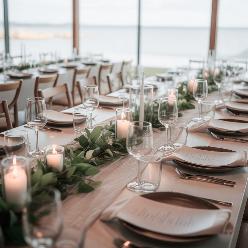
Texture plays a major role here. Matte and soft finishes photograph far better than high-gloss materials. Natural fabrics, brushed metals, real florals, and quality linens absorb light gently, creating depth and richness in images.
From experience, I can say that investing in fewer, higher-quality decor elements almost always results in better photos than filling a space with shiny accents. Thoughtful material selection ensures the camera captures elegance, not distractions.
Misplaced Florals and Installations That Block Faces or Frames
Florals are meant to enhance beauty, not hide it. Unfortunately, one of the most common wedding decor mistakes that ruin photos is poor floral placement. I’ve seen stunning arrangements accidentally block faces, cut off heads in photos, or create awkward framing around the couple.
Tall centerpieces placed on small tables can overwhelm guests and interfere with sightlines. Ceremony florals positioned too high or too close to the couple can obscure facial expressions during vows. Hanging installations, if not carefully planned, may cast shadows or intrude into key shots.
Scale and proportion are critical. Florals should complement the human form, not compete with it. Every arrangement should be positioned with seated and standing perspectives in mind, especially during emotional moments the photographer must capture clearly.
When florals are thoughtfully placed, they frame moments beautifully. When they aren’t, they become barriers between the camera and the story unfolding. Proper planning ensures florals elevate photos instead of limiting them.
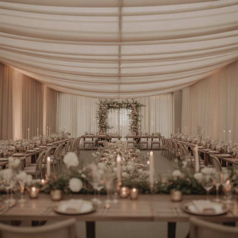
Forgetting Decor Consistency Across Different Wedding Spaces
Consistency is often overlooked, yet it plays a huge role in how cohesive wedding photos feel as a collection. Ceremony, cocktail hour, reception, and photo areas should feel connected, even if they’re styled slightly differently.
When decor styles clash from one space to another, the final photo gallery feels disjointed. A romantic ceremony paired with a modern, minimal reception can confuse the visual narrative. Each space doesn’t need to match exactly, but they should clearly belong to the same wedding story.
This mistake usually happens when decor decisions are made separately or too late in the planning process. Without a clear design vision, couples end up with beautiful individual setups that don’t flow together visually.
As a decorator, I always design with the full wedding journey in mind. Consistent color palettes, repeated textures, and intentional transitions between spaces help photos feel harmonious from start to finish.
How to Fix These Wedding Decor Mistakes Before Your Big Day
The good news is that every one of these mistakes is avoidable with the right planning and mindset. Fixing them doesn’t require perfection—it requires awareness and intention.
Start by thinking about decor from the camera’s perspective. Ask where photos will be taken most often and what will appear in the background. Walk the venue with fresh eyes and identify potential distractions early.
Communication is also key. Decorators, planners, and photographers should work together rather than in isolation. When everyone understands the visual goals, decisions become clearer and mistakes are easier to avoid.
Finally, prioritize quality and balance over trends. Timeless design choices almost always photograph better than overly trendy ones. Your photos should feel elegant years from now, not dated by what was popular at the time.
Professional Decorator Tips for Picture-Perfect Wedding Photos
Over the years, I’ve developed a few guiding principles that consistently lead to better wedding photos:
-
Design with lighting in mind, not just aesthetics
-
Keep the couple as the clear focal point in every setup
-
Use decor to frame moments, not dominate them
-
Allow space for movement, emotion, and natural interaction
These principles apply to every wedding style, budget, and venue. When followed, they create an environment where photographers can capture genuine beauty effortlessly.
Final Thoughts on Designing With Photography in Mind
Wedding decor isn’t just about how things look in the moment—it’s about how they will be remembered. Photos are the lasting proof of your day, long after the flowers fade and the candles burn out.
By avoiding these wedding decor mistakes that ruin photos, couples give themselves the gift of imagery that feels timeless, emotional, and beautifully intentional. Thoughtful decor doesn’t steal attention; it supports the story being told.
When design and photography work together, the result is more than beautiful pictures. It’s a visual legacy that reflects the care, love, and meaning behind the day itself.