Choosing the right color for your wedding outfit might seem like a small detail, but as someone who has spent years curating weddings and styling bridal parties, I can assure you it is far from trivial. The color of your outfit sets the tone for your entire wedding aesthetic. It affects not only how you feel on your big day but also how you photograph in your wedding photos, how you harmonize with your partner, and how well you blend with your overall decor.
Many couples overlook the subtle psychological and visual impact of color. Bright, bold colors can energize a space and command attention, while muted, soft tones can create elegance and sophistication. But picking the wrong shade—or ignoring how your outfit complements the season, venue, or even your skin tone—can make your carefully planned day feel disjointed.
In my experience, helping clients avoid color mistakes early in the planning process saves them stress, money, and the regret of seeing their dream wedding visually clash. By understanding the most common pitfalls, you can confidently select a wedding outfit color that elevates your special day rather than complicates it.
Common Wedding Outfit Color Mistakes Brides Make
Brides often make color mistakes that stem from following trends rather than personal style. One of the most common errors I see is choosing a color that doesn’t complement their complexion. For example, an ivory gown may look stunning in the store under soft lighting, but in natural sunlight, it can appear washed out on warmer skin tones. Similarly, off-white or cream shades might clash with certain jewelry or veil tones, creating unintended visual discord.
Another frequent mistake is ignoring the venue or season when selecting a color. A deep, rich burgundy gown may look breathtaking, but in a summer beach wedding, it can feel out of place and overly heavy. Conversely, pastels or light shades at a winter wedding may get lost against snowy or neutral backdrops. I always advise brides to consider how their outfit color interacts with the natural and decorative environment of their wedding, ensuring harmony across all visual elements.
Additionally, many brides overlook coordination with their bridal party. Bridesmaids’ dresses in clashing colors can overshadow the bride and create visual chaos in photographs. I recommend choosing your gown first and then selecting complementary hues for the bridal party, rather than letting trends dictate the palette. This approach ensures a cohesive and visually appealing wedding day experience.
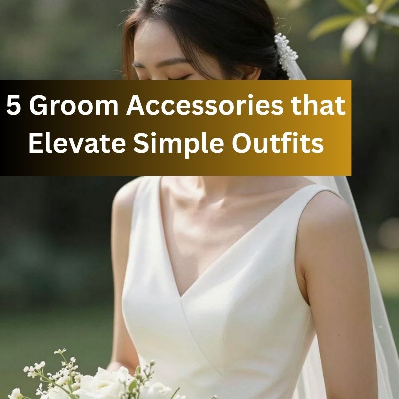
Common Wedding Outfit Color Mistakes Grooms Make
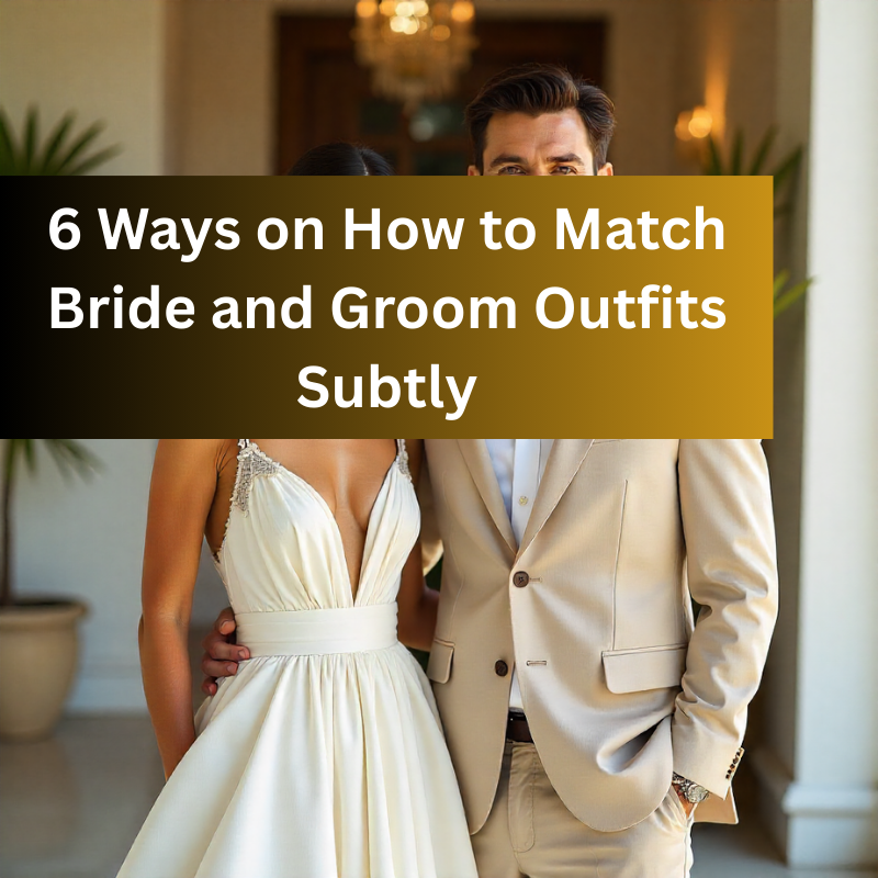
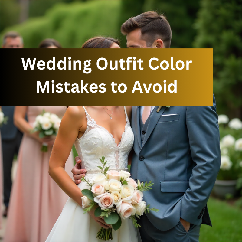
Grooms may not receive the same level of attention when it comes to outfit color, but mistakes here are equally noticeable. A common error is opting for suits or tuxedos that clash with the bride’s dress or the overall wedding palette. For instance, a gray suit might look neutral in isolation but can appear stark or cold when paired with a warm-toned gown or vibrant floral arrangements.
Another frequent misstep is over-relying on black or navy without considering lighting and setting. While these colors are classic and safe, they can appear dull in outdoor or daytime weddings, and they may not complement the vibrancy of bridesmaids’ dresses or floral decor. In my professional experience, selecting suit colors that reflect the season—lighter tones for spring and summer, richer shades for fall and winter—elevates the groom’s presence while maintaining harmony.
Accessories can also make or break the groom’s outfit color choices. A tie, pocket square, or boutonniere in an inconsistent shade can create discord. I advise careful coordination with the bridal party and decor, ensuring that even small details support the overall visual cohesion.
How Seasonal and Venue Considerations Affect Color Choices
Season and venue play a more critical role in outfit color selection than many couples realize. In spring, lighter pastel shades—think blush, lavender, and soft blues—harmonize beautifully with blooming flowers and bright natural light. Summer weddings often call for vibrant and lively colors, but heavy, dark tones can feel out of place against a sunlit backdrop.
Fall weddings allow for rich, warm tones like burgundy, deep green, or mustard, which can look spectacular in wooded or rustic venues. Winter weddings offer the opportunity for jewel tones, metallics, and classic black-and-white contrasts that bring elegance to indoor settings. The key is aligning your outfit colors with the environment so that photographs capture a sense of cohesion and intentionality.
Venues also influence the perception of color. Outdoor weddings with lots of natural light may make pastel colors pop, while indoor venues with dim lighting might require deeper shades to avoid a washed-out appearance. I always recommend brides and grooms test their outfit colors in similar lighting conditions before finalizing choices. Seeing a gown or suit under the exact light it will be worn can prevent surprises and costly mistakes.
The Impact of Skin Tone and Complexion on Outfit Color Selection
One of the most overlooked factors in choosing a wedding outfit color is how it complements your skin tone. Many brides and grooms focus solely on trends or favorite colors without realizing that certain shades can either enhance their natural glow or wash them out completely. For brides, warm skin tones often look stunning in ivory, champagne, and soft peach shades, while cooler skin tones are beautifully complemented by pure whites, icy blues, and blush tones. Understanding this can make the difference between looking radiant in your photos or feeling like something is slightly off.
For grooms, skin tone considerations are equally important. Warm undertones tend to shine in earthy shades like taupe, brown, or olive, while cool undertones work well with charcoal, navy, and slate colors. I often advise clients to experiment with different shades during fittings and to step outside in natural light before finalizing their choice. Even a color that looks perfect in the store can behave differently under sunlight or indoor lighting, and testing beforehand avoids any unpleasant surprises.
It’s not just about the primary color, either. Details like embroidery, lace overlays, or subtle patterns can also enhance or clash with your complexion. I always encourage brides and grooms to think holistically: the color, texture, and finish of the outfit should all work together to complement your natural coloring.
Avoiding Color Clashes with Bridesmaids, Groomsmen, and Decor
Color coordination with the bridal party and overall wedding decor is one of the most common areas where mistakes occur. Brides sometimes pick bold or unconventional gown colors without considering how the bridesmaids’ dresses or groomsmen’s suits will complement them. The result can be a visual clash that stands out awkwardly in photographs.
A simple solution is to choose your gown or suit first and then build your color palette around it. I often create a swatch board with clients, combining outfit colors with florals, table settings, and venue elements to see how everything harmonizes. When everyone’s attire is visually coordinated but not identical, the result feels polished and intentional. Small touches—like matching a boutonniere to a bridesmaid’s dress or a sash to a table centerpiece—can unify the entire aesthetic subtly but effectively.
I also warn couples against overusing highly contrasting colors. While contrast can be striking, too much of it can dominate photographs and distract from the main subjects—you and your partner. Aim for complementary tones, shades within the same family, or neutral balances to maintain elegance and cohesion.
Misunderstanding Cultural or Traditional Color Meanings
Another critical mistake I’ve seen is overlooking cultural or traditional color meanings. Colors carry significant symbolism in many cultures, and wearing the wrong shade can unintentionally send the wrong message or feel disrespectful. For instance, in some cultures, red symbolizes prosperity and happiness, while in others, it may be associated with mourning. White is universally associated with weddings in Western cultures but can have different meanings elsewhere.
Understanding these nuances ensures your outfit honors the cultural context of your wedding. I advise couples to research traditions carefully and, if needed, consult family members or cultural advisors. Even if you’re aiming for a modern, non-traditional look, incorporating meaningful colors can enrich your wedding story and prevent inadvertent mistakes.
Tips for Coordinating Colors Without Overdoing It
Color coordination doesn’t have to be complicated. In fact, some of the most elegant weddings feature subtle, understated palettes. A few tips I share with clients include:
-
Stick to 2-3 main colors: This keeps the look cohesive without being overwhelming.
-
Use neutrals strategically: Whites, creams, grays, and muted metallics can tie bolder colors together.
-
Balance warm and cool tones: Avoid saturating your palette with only warm or only cool shades; mixing tones thoughtfully creates depth.
-
Incorporate textures and finishes: Matte, satin, and lace finishes can add visual interest without introducing extra colors.
These small decisions prevent “color overload” and ensure that your outfit, bridal party attire, and decor work together seamlessly.
How Accessories and Details Can Fix or Enhance Color Choices
Even if you’re unsure about your primary outfit color, accessories provide opportunities to fine-tune the overall look. Jewelry, ties, belts, sashes, shoes, and veils can either reinforce or correct your color palette. For instance, a bride wearing a slightly off-tone gown can use a metallic belt or subtle embroidery to harmonize with the wedding colors. Grooms can use pocket squares, ties, and cufflinks to echo key colors in the floral arrangements or bridesmaids’ dresses.
Attention to these details elevates the entire ensemble. I always tell clients: “It’s not just the color of your dress or suit—it’s how every small element interacts.” When accessories are chosen thoughtfully, they prevent clashes, enhance harmony, and often become memorable highlights in photos.
Expert Advice on Picking the Perfect Wedding Outfit Color
After years of working with countless weddings, I’ve distilled my advice into a few core principles:
-
Start with your vision: Consider your wedding theme, venue, and desired atmosphere.
-
Prioritize harmony over trends: Classic, complementary colors often photograph better and remain timeless.
-
Test in real conditions: Natural light, indoor lighting, and even seasonal changes affect how colors appear.
-
Consider your partner: Coordinated, not matching, outfits create a balanced and elegant look.
-
Trust your instincts: You know yourself best; choose colors that make you feel confident, radiant, and comfortable.
By keeping these principles in mind, you can avoid the most common pitfalls and make confident, beautiful choices that enhance every moment of your wedding day.
Conclusion: Making Confident, Beautiful Color Choices
Wedding outfit color mistakes are surprisingly common, but they are entirely avoidable with thoughtful planning and expert guidance. From understanding how your skin tone interacts with your chosen shades, to coordinating with your partner, bridal party, and decor, every detail matters. By prioritizing harmony, considering cultural and seasonal contexts, and using accessories wisely, you can create a cohesive, stunning visual narrative that elevates your wedding experience.
Remember, your outfit color isn’t just a fashion choice—it’s a reflection of your personality, style, and the atmosphere you want to create. With careful planning and attention to detail, your wedding outfit will be flawless, photogenic, and unforgettable.